
WCAG Color Contrast: The Ratios That Matter and How to Fix Failing Colors
Low-contrast text is the most common accessibility failure on the web, and also one of the easiest to fix. Light grey text on white might look elegant in a mockup, but on…
 Keyur
4 min read
On this page
Low-contrast text is the most common accessibility failure on the web, and also one of the easiest to fix. Light grey text on white might look elegant in a mockup, but on a phone in sunlight, or for anyone with low vision, it simply disappears. This guide explains the WCAG contrast ratios, which ones apply where, and practical ways to fix colours that fail without abandoning your brand.
What the contrast ratio measures
WCAG compares the relative luminance (perceived brightness) of two colours and expresses the difference as a ratio from 1:1 (identical) to 21:1 (black on white). The calculation weights green most and blue least, because that is how our eyes respond. Hue does not count: a red and a green with the same luminance have a ratio of about 1:1 even though they look very different to most people, and identical to some colour-blind users.
<h2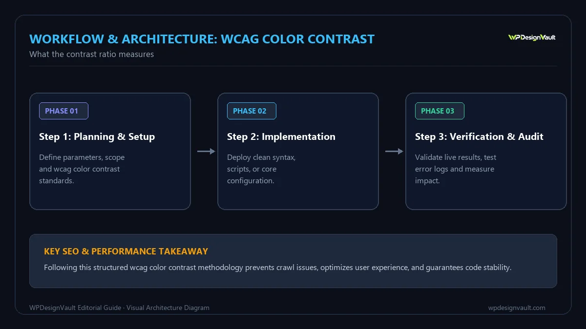
The ratios that matter
| What | AA (minimum) | AAA (enhanced) |
|---|---|---|
| Body text | 4.5:1 | 7:1 |
| Large text (24 px+, or 18.66 px+ bold) | 3:1 | 4.5:1 |
| Icons, input borders, focus indicators, chart lines (non-text contrast) | 3:1 | – |
Most laws and policies that reference WCAG require level AA. The figures come from WCAG 2.1 and 2.2, success criteria 1.4.3 (text) and 1.4.11 (non-text).
What is exempt
- Logos and brand names in a logo.
- Purely decorative text and images.
- Text in disabled controls (though making them readable is still kind).
Check your colours
Paste the text and background colours into the contrast checker. It shows the ratio, the AA and AAA verdicts for normal and large text, and suggests the nearest passing shade. Check the combinations people actually see:
- body text on the page background and on cards;
- muted text such as captions, dates and placeholders;
- button text on the button colour, in normal and hover states;
- links against surrounding text if colour is the only difference;
- text over images or gradients, at the lightest point behind the text.
How to fix failing colours
Darken (or lighten) the text, not the brand
You rarely need to change your brand colour. Keep it for large headings, icons and backgrounds, and create a darker shade for body text and small links. A mid-blue such as #3b82f6 fails on white for small text (about 3.7:1), while #1d4ed8 from the same family passes (about 6.7:1).
Swap white text for dark text on light brand colours
Yellow, lime, light orange and turquoise buttons almost never pass with white text. Dark text on them usually does, and looks deliberate.
Stop using grey for important text
Muted grey is fine for secondary information if it passes. #64748b on white is about 4.8:1 and passes; #94a3b8 is about 2.6:1 and fails. If you need hierarchy, use size and weight as well as colour.
Put a scrim behind text on images
Text over photos changes contrast from one pixel to the next. Add a semi-transparent dark overlay or a solid panel behind the text, then test against the lightest part of the image.
Build contrast into your design system
Pick text colours once and reuse them. A small set of tested pairs is easier to maintain than checking every new page:
- text-primary and text-muted on background and surface colours;
- on-brand (the text colour for brand-coloured buttons);
- link colour, plus an underline so colour is not the only cue.
The design token generator creates colour scales and reports which steps pass on white and on dark backgrounds, so you can choose text colours from the passing ones. In Elementor, store the tested pairs as Global Colors.
Dark mode needs its own check
A palette that passes on white does not automatically pass on near-black. Pure white text on pure black can also feel harsh for long reading; an off-white such as #e2e8f0 on #0f172a still passes comfortably (about 14:1).
Contrast is necessary, not sufficient
Passing ratios do not guarantee readability. Thin fonts, small sizes and long line lengths also matter. Use at least 16 px for body text, avoid very light font weights for small text, and test pages on a real phone outdoors.
Summary
- 4.5:1 for normal text, 3:1 for large text and for icons and UI borders.
- Fix failures with a darker text shade or dark text on light buttons, not by abandoning your brand colour.
- Define tested colour pairs once and reuse them everywhere.
Related free tools for this topic
WCAG Color Contrast Checker
Check text and background colours against WCAG 2 AA and AAA contrast requirements, and get a suggested accessible…
Type Scale Generator
Build a harmonious typographic scale from a base size and ratio, preview it, and export CSS variables. Switch…
CSS Text Shadow Generator
Create subtle, glowing, outlined or layered CSS text shadows with a live preview on your own text, then…
Spacing Scale Generator (4pt & 8pt Grid)
Create a consistent spacing system on a 4pt or 8pt grid and export it as CSS custom properties…
REM to PX Converter
Convert rem values to pixels for any root font size, with a quick reference table.
PX to REM Converter
Convert pixels to rem instantly with any base font size, see a reference table, or convert every px…
Related resources

SaaS hero with dashboard preview
Two-column hero: headline, supporting text, two buttons and a trust line beside a visual panel. Stacks to one…

Centred SaaS hero with product window
Centred hero with a large headline, supporting text and two buttons, with optional highlights and a product window…

Dark studio hero with service highlights
Centred hero with a large headline, supporting text and two buttons, with optional highlights and a product window…
More guides
Convert PDF Pages to JPG or PNG Images
Export PDF pages as PNG or JPEG images in your browser. Learn which scale to use for websites, slides and print, when…

Turn Design Mockups into One Client-Ready PDF
Sending a client loose screenshots invites confusion. Learn how to combine images into a single PDF with the right page size, orientation…
PX vs REM vs EM: Which CSS Unit to Use
Which CSS unit to use for font sizes, spacing, borders and breakpoints, tested in Chromium: rem follows a visitor's text size, px…
Comments