
PX vs REM vs EM: Which CSS Unit to Use
Which CSS unit to use for font sizes, spacing, borders and breakpoints, tested in Chromium: rem follows a visitor's text size, px does not, and em has traps worth knowing.
 Keyur
10 min read

On this page
Use rem for font sizes and most spacing, em when something should scale with its own text (such as button padding or an icon beside a label), and px for borders, outlines and shadows. That is the short answer to px vs rem vs em. The reason is accessibility: rem and em follow the default text size a visitor sets in their browser, while px does not. In a test in Chromium, raising the browser's default font size from 16px to 20px left px text at 16px but made rem text 20px.
This guide explains how each unit is calculated, what changes when visitors adjust their browser settings or zoom, which unit to use for each CSS property, how em compounding catches people out, and how to apply the same choices in WordPress and Elementor.
The three units at a glance
Table: px, rem and em compared
| Unit | Relative to | Follows the browser's default text size? | Best for |
|---|---|---|---|
px |
Nothing; an absolute CSS unit (1px = 1/96 inch) | No | Borders, outlines, shadows, hairlines |
rem |
The root (html) element's font size |
Yes | Font sizes, margins, padding, gaps, layout widths |
em |
The parent's font size when used for font-size; the element's own font size for other properties |
Yes | Padding and icons that should track their own text; letter-spacing |
MDN summarises em neatly: it means "my parent element's font-size" when used for font-size, and "my own font-size" when used for anything else. A CSS pixel is not necessarily one physical pixel; on high-density screens it spans several device pixels.

Why the unit matters: text size versus zoom
Visitors can make text bigger in two ways:
- Browser zoom (Ctrl/Cmd and +) scales everything, including px values. Every unit responds.
- Default font size (for example Chrome: Settings → Appearance → Font size; Firefox: Settings → Fonts) changes the base text size only. Many people with low vision use this rather than zoom, because it enlarges text without enlarging everything else.
Only rem and em respond to the second method. This test, run in headless Chromium 141, shows the difference:
Table: Computed sizes when the browser's default font size changes (tested in Chromium)
| CSS | Default 16px | Default 20px |
|---|---|---|
font-size: 16px |
16px | 16px (unchanged) |
font-size: 1rem |
16px | 20px |
padding: 1.5rem |
24px | 30px |
WCAG success criterion 1.4.4 requires text to be resizable up to 200% without loss of content or functionality. Using rem for text, and letting containers grow with it, is one of the most reliable ways to support that, and it respects people who changed their default text size rather than zooming.
Converting px to rem
Divide the pixel value by the root font size. With the browser default of 16px:
Table: Common px to rem conversions (16px root)
| px | rem | Typical use |
|---|---|---|
| 12 | 0.75rem | Small labels |
| 14 | 0.875rem | Captions |
| 16 | 1rem | Body text |
| 18 | 1.125rem | Large body text |
| 20 | 1.25rem | H4, lead text |
| 24 | 1.5rem | H3, card padding |
| 32 | 2rem | H2, section gaps |
| 48 | 3rem | H1, large spacing |
| 64 | 4rem | Section padding |
The PX to REM Converter handles single values with a custom base size and can convert every px value in a pasted stylesheet, with an option to keep 1px borders as they are. The REM to PX Converter does the reverse when you need to know what a rem value renders as.
<h2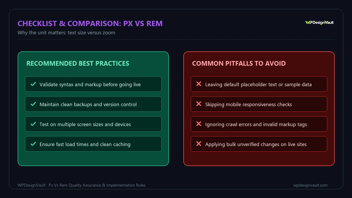
Which unit for which property
Table: Recommended units by CSS property
| Property | Recommended unit | Why |
|---|---|---|
font-size |
rem | Follows user settings without compounding |
margin, padding, gap (layout) |
rem | Spacing stays proportional when text grows |
| Button and badge padding | em | A larger or smaller button keeps its proportions, e.g. padding: 0.75em 1.25em |
| Icons next to text | em | The icon tracks the size of its label |
letter-spacing |
em | Tracking scales with the text it applies to |
line-height |
Unitless (e.g. 1.5) | Scales with the element's own font size and inherits cleanly |
border, outline, box-shadow |
px | Thin lines should stay thin and crisp |
max-width of text |
ch or rem | 70ch keeps line length readable at any text size |
| Media query breakpoints | em (or px) | em breakpoints adapt when users change their default text size |
| Fluid headings | clamp() mixing rem and vw |
Scales with the screen while staying tied to user settings |
A short example
body {
  font-size: 1rem;      /* follows the user's default */
  line-height: 1.6;
}
.card {
padding: 1.5rem; /* layout spacing in rem */
border: 1px solid #e5e7eb; /* hairline in px */
}.button {
font-size: 1rem;
padding: 0.75em 1.25em; /* scales with the button's own text */
}.button--small { font-size: 0.875rem; } /* padding shrinks with it */.prose { max-width: 70ch; }@media (min-width: 48em) { /* 768px at the default 16px */
.card { padding: 2rem; }
}The em compounding trap
Because font-size in em is relative to the parent, nested elements multiply. In the same Chromium test, a span at 0.8em inside another span at 0.8em inside 16px text rendered at 10.24px, which is 64% of the base. MDN shows the same effect with nested lists set to 1.3em, where each level grows larger. Use rem for font sizes to avoid this, and reserve em for properties that should follow the element's own text.
Media queries: em is based on the browser default
Relative units inside media queries are not affected by the font size you set on the html element. We tested this in Chromium with html { font-size: 62.5%; } and a 600px-wide viewport: a @media (min-width: 50em) rule did not apply, because 50em was still calculated as 800px from the browser's 16px default, not 500px from the reduced root. em breakpoints do change when a visitor raises their default font size, which keeps layouts from cramming large text into narrow columns.
Why not set the root to 62.5%?
A popular trick sets html { font-size: 62.5%; } so that 1rem equals 10px and conversions are easy. It still respects user settings, but it has drawbacks:
- Every third-party component that assumes 1rem is about 16px, such as plugins, embeds and block styles, suddenly renders smaller.
- You must remember to reset body text to
1.6rem, and anything you miss appears at 10px. - As the test above shows, media queries in em do not follow it, which can confuse teams.
Keep the root at the browser default and use a converter or CSS variables for the arithmetic instead.
Using rem and em in WordPress and Elementor
- Block themes: define font sizes and spacing in
theme.jsonin rem so editors choose from consistent presets. - Block editor: typography and spacing controls accept units; prefer rem for font size and spacing.
- Elementor: each size control has a unit selector (px, em, rem, %, vw and a custom option). Set Global Font sizes in rem, container padding and gaps in rem, button padding in em, and keep borders in px. For fluid headings, enter a
clamp()value with the custom unit; our guide to fluid typography in Elementor shows how, and the CSS Clamp Generator calculates the values.
To keep sizes and spacing consistent across a site, store them as variables; the Design Token Generator outputs a type scale in rem along with spacing and colour tokens.
How to test your site
- Change the default font size in your browser settings to "Large" or "Very large", then reload. Text should grow, and nothing should overlap, be cut off or overflow its container.
- Zoom to 200% and check the same things. This is the WCAG 1.4.4 check.
- Inspect a few elements in developer tools and look for font sizes set in px.
- Check fixed heights. Containers with a fixed height in px are the most common reason text overflows when it grows; use
min-heightor let content set the height.
Other units you will meet
Table: Other CSS length units and when they help
| Unit | Relative to | Good for | Watch out for |
|---|---|---|---|
% |
The parent element (for widths) or the parent font size (for font-size) |
Fluid widths and columns | Percentage padding and margins are based on the parent's width, even for top and bottom |
vw / vh |
1% of the viewport width / height | Full-screen sections; the fluid part of clamp() |
Do not use alone for text; 100vh can be taller than the visible area on phones |
dvh / svh / lvh |
The dynamic, small or large viewport height | Full-height mobile sections that account for browser toolbars | Newer units; check support for your audience |
ch |
The width of the "0" character in the current font | Limiting line length, e.g. max-width: 70ch |
Width varies between fonts |
Worked example: converting a card component
The following is an illustrative example. A theme's card component was written entirely in px:
- Title 20px, text 15px, padding 24px, gap between cards 24px, border 1px, button text 14px with 10px × 18px padding.
Converted with the recommendations above (16px root):
- Title
1.25rem; text1rem(raised from 15px for readability); card padding1.5rem; grid gap1.5rem; border stays1px. - Button text
0.875rem; button padding0.7em 1.3em, so a larger button variant keeps the same proportions automatically.
At the default 16px, the converted card looks almost identical to the original. When a visitor sets a larger default text size, the title, text, spacing and button all grow together, while the border stays a crisp single pixel. Before the change, only zoom could enlarge the text.
Common mistakes
- Body text in px, which ignores the user's text size setting. This is the most important thing to fix.
- Nested em font sizes that compound unexpectedly.
- Font sizes in vw alone, which do not follow user settings and can become tiny on phones.
- Fixed px heights on text containers.
- Converting borders to rem, producing fractional, blurry lines.
- The 62.5% root trick breaking third-party components.
Troubleshooting
Table: Unit problems: symptoms, likely causes and fixes
| Symptom | Likely cause | Fix |
|---|---|---|
| Text does not grow when the browser text size is increased | Font sizes in px | Convert font sizes to rem |
| Text gets smaller in nested lists or components | em compounding | Use rem for font sizes |
| Text overflows boxes when enlarged | Fixed px heights or widths | Use min-height, rem widths or content-driven sizing |
| Third-party widgets look tiny | Root set to 62.5% | Restore the root to 100% and convert your own values |
| Breakpoints fire at unexpected widths | Assuming em in media queries follows the root size | Remember em breakpoints use the browser default (usually 16px) |
Frequently asked questions
Is rem better than px?
For font sizes and most spacing, yes, because rem follows the visitor's default text size. px is still the right choice for borders, outlines and shadows, where you want fixed, crisp lines.
What is the difference between rem and em?
rem is relative to the root element's font size, so it means the same everywhere on the page. em is relative to the parent's font size for font-size, and to the element's own font size for other properties, so it changes with context.
Does browser zoom work with px?
Yes. Zoom scales px values along with everything else. The difference appears when visitors change their default text size instead of zooming: px font sizes ignore that setting, while rem and em follow it.
How do I convert px to rem?
Divide by the root font size, normally 16: 24px ÷ 16 = 1.5rem. A converter does this for single values or whole stylesheets.
Should I use em or px for media queries?
em breakpoints adapt when a visitor increases their default text size, which can keep layouts from squeezing large text into narrow columns. px breakpoints are simpler to reason about. Either works; em offers a small accessibility advantage.
Should line-height use a unit?
Usually not. A unitless line height such as 1.5 is multiplied by each element's own font size and inherits cleanly, whereas a fixed value in px or rem does not adjust when the font size changes.
Is the 62.5% root font-size trick bad?
It is not inaccessible on its own, but it causes practical problems: third-party components render smaller, every font size needs resetting, and media query em values do not follow it. Keeping the default root and using a converter is simpler.
Can I use vw for font sizes?
Not on its own. vw-only sizes ignore user text settings and can become too small on phones. Combine vw with rem inside clamp() to scale with the screen while respecting user preferences.
What unit should Elementor spacing use?
rem for container padding and gaps, em for padding inside buttons, and px for borders. Percentages are sometimes useful for desktop gaps, but they change with container width, which makes spacing less predictable.
Does using rem fix all accessibility issues with text?
No. It helps text respond to user settings, but you also need sufficient colour contrast, readable line lengths, containers that grow with text, and testing at 200% zoom.
Next step
Find any font sizes set in px in your theme or page builder, convert them with the PX to REM Converter, and test your pages with a larger default text size. For more on typography and layout, browse our web design guides.
Related free tools for this topic
PX to REM Converter
Convert pixels to rem instantly with any base font size, see a reference table, or convert every px…
Type Scale Generator
Build a harmonious typographic scale from a base size and ratio, preview it, and export CSS variables. Switch…
CSS Text Shadow Generator
Create subtle, glowing, outlined or layered CSS text shadows with a live preview on your own text, then…
Spacing Scale Generator (4pt & 8pt Grid)
Create a consistent spacing system on a 4pt or 8pt grid and export it as CSS custom properties…
REM to PX Converter
Convert rem values to pixels for any root font size, with a quick reference table.
CSS Gradient Generator
Build linear, radial and conic CSS gradients visually with multiple colour stops and copy production-ready code.
Related resources

SaaS hero with dashboard preview
Two-column hero: headline, supporting text, two buttons and a trust line beside a visual panel. Stacks to one…

Centred SaaS hero with product window
Centred hero with a large headline, supporting text and two buttons, with optional highlights and a product window…

Dark studio hero with service highlights
Centred hero with a large headline, supporting text and two buttons, with optional highlights and a product window…
More guides
Convert PDF Pages to JPG or PNG Images
Export PDF pages as PNG or JPEG images in your browser. Learn which scale to use for websites, slides and print, when…

Turn Design Mockups into One Client-Ready PDF
Sending a client loose screenshots invites confusion. Learn how to combine images into a single PDF with the right page size, orientation…

WCAG Color Contrast: The Ratios That Matter and How to Fix Failing Colors
Low-contrast text is the most common accessibility failure on the web, and also one of the easiest to fix. Light grey text…
Comments