
Free
Call to action
Slim split CTA row
Slim call-to-action row with a top border, headline on the left and buttons on the right. Styled for…

Rounded gradient card with headline and text on the left and buttons on the right. Styled for a agency website in a light colour scheme.
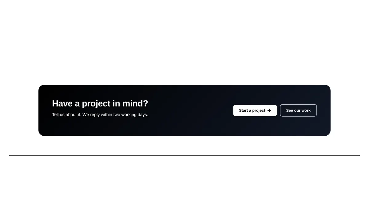
Rounded gradient card with headline and text on the left and buttons on the right. Styled for a agency website in a light colour scheme.
6 containers and these free Elementor widgets: heading (1), text-editor (1), button (2). No Elementor Pro, add-ons, images or external files are required; fonts are inherited from your theme.
Built with flexbox and grid containers. Multi-column rows stack on tablets or phones, grids drop to two columns on tablets and one on phones, and heading sizes scale down at each breakpoint. Tested at 1440px, 820px and 390px wide.
Slim call-to-action row with a top border, headline on the left and buttons on the right. Styled for…

Slim call-to-action row with a top border, headline on the left and buttons on the right. Styled for…

Compact centred card with an icon, headline, short text and one button. Styled for a medical clinic website…