
Natural-Looking Box Shadows with Layered Shadows
Why one big shadow looks flat and several soft ones look real, measured pixel by pixel in Chromium, with copy-ready elevation recipes and how to use them in WordPress and Elementor.
 Keyur
10 min read
On this page
To make box shadows look natural, layer several soft shadows instead of using one big blurry one. Each layer doubles the offset and blur of the one before, and each is quite transparent, for example 8% opacity. A tight, small layer gives the crisp contact shadow right under the edge. Larger layers build a soft, fading spread below it. Tint the shadow towards your background or brand colour instead of pure black, keep the light coming from one direction across the site, and use two to five layers. The box-shadow property accepts a comma-separated list, so this is plain CSS that works in every current browser.
This post explains why single shadows look flat, gives copy-ready layered recipes for three elevation levels, and covers tinting, dark backgrounds and hover states. It also shows how to use the recipes in WordPress and page builders. We rendered a single shadow and a layered shadow in Chromium and measured the pixels below and above the card, so you can see the difference in numbers as well as by eye.
How box-shadow works
Each shadow in box-shadow has up to six parts:
box-shadow: [inset] offset-x offset-y blur-radius spread-radius color;Table: The parts of a box-shadow
| Part | What it does | Natural-looking range |
|---|---|---|
| offset-x | Moves the shadow sideways | Usually 0, so light seems to come from above |
| offset-y | Moves the shadow down | 1 – 32px, growing with elevation |
| blur-radius | Softens the edge | About twice the offset |
| spread-radius | Grows or shrinks the shadow before blurring | 0, or slightly negative for tighter shadows |
| color | Shadow colour and opacity | Low opacity, 4 – 12% per layer |
| inset | Draws the shadow inside the box | For pressed buttons and input fields |
Separate several shadows with commas. The first one in the list is drawn on top. Shadows follow the element's border-radius, so rounded cards get rounded shadows.
Before you start
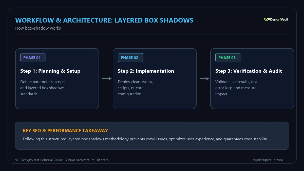
- Know where your CSS will live: your theme's Additional CSS, a child theme stylesheet, or your page builder's custom CSS if you have it.
- Decide on the light direction. Light from directly above (no horizontal offset) is the simplest and works for most sites.
- List your background colours. Shadows need checking on each surface they will sit on.
- Find your existing shadows. Search your theme CSS for
box-shadowso you can replace them consistently rather than adding a new style alongside old ones. - Have developer tools open so you can edit shadows live and compare before copying values into your stylesheet.
Why one big shadow looks flat
Real objects cast two kinds of shadow at once: a dark, sharp shadow where they nearly touch the surface, and a broad, faint shadow from light bouncing around the room. A single 0 10px 30px rgba(0,0,0,0.25) shadow tries to do both and does neither well. It looks like a grey haze, it is too dark far from the card, and it spills above the top edge.
Worked example: single versus layered, measured
We rendered a white 200 × 150 pixel card with 12-pixel rounded corners on a light grey background (#f3f4f6) in Chromium. We then sampled the pixels directly below the card's bottom edge and above its top edge. The two shadows compared:
/* Single */
box-shadow: 0 10px 30px rgba(0, 0, 0, 0.25);
/* Layered */
box-shadow:
0 1px 1px rgba(0, 0, 0, 0.08),
0 2px 4px rgba(0, 0, 0, 0.08),
0 4px 8px rgba(0, 0, 0, 0.08),
0 8px 16px rgba(0, 0, 0, 0.08),
0 16px 32px rgba(0, 0, 0, 0.08);Table: Pixel brightness below and above the card (red channel, 0 = black, 243 = background)
| Distance from edge | Single shadow | Layered shadow |
|---|---|---|
| 1px below | 199 | 189 (darker contact) |
| 4px below | 204 | 206 |
| 8px below | 210 | 219 (lighter) |
| 16px below | 223 | 232 |
| 32px below | 239 | 241 |
| 1px above the top edge | 228 | 235 (less spill) |
The layered shadow is darker right at the edge, which grounds the card, and fades faster in the middle distance, which keeps it light and airy. It also casts much less shadow above the card, as you would expect from light above. The single shadow is a more uniform haze. Those are the differences people see as "natural" versus "flat".
Recipes for three elevation levels
Use a small set of elevations across a site, with the larger ones reserved for things that float above the page:
:root {
  --shadow-color: 220 40% 30%;
/* Level 1: cards resting on the page */
--shadow-1:
0 1px 1px hsl(var(--shadow-color) / 0.08),
0 2px 4px hsl(var(--shadow-color) / 0.08); /* Level 2: raised cards, hover states, dropdowns */
--shadow-2:
0 1px 1px hsl(var(--shadow-color) / 0.07),
0 2px 4px hsl(var(--shadow-color) / 0.07),
0 4px 8px hsl(var(--shadow-color) / 0.07),
0 8px 16px hsl(var(--shadow-color) / 0.07); /* Level 3: modals and popovers */
--shadow-3:
0 1px 1px hsl(var(--shadow-color) / 0.06),
0 2px 4px hsl(var(--shadow-color) / 0.06),
0 4px 8px hsl(var(--shadow-color) / 0.06),
0 8px 16px hsl(var(--shadow-color) / 0.06),
0 16px 32px hsl(var(--shadow-color) / 0.06),
0 32px 64px hsl(var(--shadow-color) / 0.06);
}.card { box-shadow: var(--shadow-1); }
.card:hover { box-shadow: var(--shadow-2); }
.modal { box-shadow: var(--shadow-3); }As elevation rises, add layers and lower each layer's opacity slightly, so the total darkness stays similar while the shadow spreads further. Keep the vertical offsets in pixels; shadows are visual details that should not grow with the visitor's text size. Our guide to px, rem and em explains which properties suit each unit.
Tint the shadow
Shadows in the real world pick up colour from their surroundings. Pure black at low opacity over a coloured background looks grey and dirty. A dark, desaturated version of the background or brand hue looks cleaner. In our render, the tinted layered shadow (hsl(220 40% 30%)) produced pixels such as rgb(199, 201, 211) right under the card: slightly blue, rather than neutral grey.
- Take your page background colour.
- Keep its hue, lower the lightness to about 20 – 35% and the saturation to about 30 – 50%.
- Use that colour at low opacity in every layer.
The colour converter turns a hex colour into HSL so you can adjust hue, saturation and lightness separately.
Shadows on dark backgrounds
On a dark page, shadows barely show, because there is little room to get darker. Instead:
- Show elevation with a slightly lighter surface colour for raised elements.
- Use a thin, subtle border (for example 1px at low opacity) to separate surfaces.
- If you keep shadows, use pure black at higher opacity and fewer, tighter layers.
Hover and focus states
Raising a card on hover by moving to the next shadow level, often with a small upward move, gives clear feedback. Animate transform rather than changing the shadow's layout:
.card {
  box-shadow: var(--shadow-1);
  transition: box-shadow 200ms ease, transform 200ms ease;
}
.card:hover {
  box-shadow: var(--shadow-2);
  transform: translateY(-2px);
}
@media (prefers-reduced-motion: reduce) {
  .card { transition: none; }
}
Do not rely on a shadow as the only focus indicator for keyboard users. Shadows are often too subtle to see. Use a visible outline, and make sure it has enough contrast; our guide to colour contrast covers the ratios for interface components.
Inset shadows for inputs and pressed states
An inset shadow is drawn inside the element, which makes it look recessed. Two common uses:
/* A text field that looks slightly sunken */
.input {
  box-shadow: inset 0 1px 2px hsl(var(--shadow-color) / 0.12);
}
/* A button that looks pressed while clicked */
.button:active {
box-shadow: inset 0 2px 4px hsl(var(--shadow-color) / 0.2);
transform: translateY(1px);
}Keep inset shadows small and subtle. A deep inset shadow on a form field can make it look disabled, and any input still needs a visible border so people can find it.
Treat elevation as part of your design system
Shadows look most natural when they are consistent. If every designer or page invents its own shadow, the light seems to come from different places and components look as if they belong to different sites. A small system avoids that:
Table: An example elevation system
| Level | Used for | Shadow |
|---|---|---|
| 0 | Flat sections, most content | None |
| 1 | Cards, tiles, images on the page | var(--shadow-1) |
| 2 | Hovered cards, dropdowns, sticky headers | var(--shadow-2) |
| 3 | Modals, popovers, toasts | var(--shadow-3) |
Write the levels down with your colours and spacing, and use the variables everywhere instead of pasting raw values. Changing the shadow colour or strength across the whole site then becomes one edit.
Using layered shadows in WordPress and page builders
- Theme CSS: add the variables and classes above to your theme's Additional CSS, then apply the class to blocks or widgets through their "Additional CSS class" field.
- Elementor: its Box Shadow control sets a single shadow. For layered shadows, add a CSS class in the Advanced tab and style it in your theme's CSS. With Elementor Pro, you can also paste the
box-shadowinto the element's Custom CSS. - Block themes: recent WordPress versions include shadow presets in Global Styles; you can define your own presets in
theme.jsonusing the same comma-separated values.
To build and preview a layered shadow visually, the box shadow generator supports up to four layers with separate offset, blur, spread, colour and opacity controls, and includes a "Layered" preset. If you manage spacing and colours as tokens, the design token generator outputs CSS variables you can keep alongside your shadow variables.
Verify your shadows
- Check the shadow on every background it will appear on: white, light grey, brand colour and dark sections.
- Zoom in on the edges. The contact area should be the darkest part, fading smoothly outwards.
- Look at the top edge. A natural shadow casts little or nothing above the element.
- Compare elevations side by side; each level should look clearly higher than the one below.
- Scroll a page with many shadowed cards on a mid-range phone to check that scrolling stays smooth.
Common mistakes
- One heavy black shadow at 25 – 50% opacity.
- Shadows with horizontal offsets in different directions on different components.
- Too many elevation levels, so nothing stands out.
- Large spread values that make shadows look like borders.
- Pure black shadows on coloured backgrounds.
- Animating large shadows on many elements at once, which can make scrolling stutter on low-end devices.
- Using
box-shadowon a transparent PNG and expecting the shadow to follow the image's shape; usefilter: drop-shadow()for that.
Troubleshooting
Table: Box shadow problems and fixes
| Symptom | Likely cause | Fix |
|---|---|---|
| Shadow looks muddy | Black shadow at high opacity | Layer several low-opacity shadows and tint them |
| Shadow clipped on one side | Parent has overflow: hidden |
Add padding to the parent or move the shadow to a wrapper |
| Shadow is square on a rounded card | Border radius set on a child, not the element with the shadow | Put border-radius on the same element as the shadow |
| Shadow ignores an image's transparent areas | box-shadow follows the box, not the pixels |
Use filter: drop-shadow() |
| Shadow invisible on a dark section | Too little contrast with the background | Use a lighter surface or a subtle border instead |
| Hover animation stutters | Many large shadows animating at once | Animate transform, or fade a pre-drawn shadow with opacity on a pseudo-element |
Frequently asked questions
How do I make a box shadow look natural?
Layer several soft, low-opacity shadows with increasing offset and blur, keep the light coming from above, and tint the shadow colour towards the background instead of pure black.
How many shadow layers should I use?
Two for subtle cards, four to six for floating elements such as modals. More layers rarely make a visible difference.
Can box-shadow have multiple shadows?
Yes. Separate each shadow with a comma. The first shadow in the list is drawn on top.
What opacity should a layered shadow use?
Around 4 – 12% per layer is typical. The layers add together, so the darkest part still reads clearly.
Should shadows use px or rem?
px. Shadows are visual details that should stay the same when a visitor increases their text size.
What is the difference between box-shadow and drop-shadow?
box-shadow follows the element's box and border radius. filter: drop-shadow() follows the visible pixels, which suits transparent images and icons, but it accepts only one shadow per function.
Do layered shadows affect performance?
For a normal number of cards, not noticeably. Very large blurs on many animated elements can cost paint time on low-end devices, so animate transform rather than the shadow.
How do I add a layered shadow in Elementor?
The Box Shadow control sets one shadow. Add a CSS class to the element and define the layered shadow in your theme's CSS, or use Pro's Custom CSS.
Why does my shadow appear above the card?
A large blur spreads in every direction. Use smaller layers with a downward offset, or a slightly negative spread, so little shows above the top edge.
Do shadows work in dark mode?
They are much less visible on dark backgrounds. Lighter surfaces and subtle borders usually show elevation better there.
Next step
Replace one heavy shadow on your site with the Level 1 recipe above. Fine-tune the layers in the box shadow generator and compare the two on the same background.
Related free tools for this topic
CSS Box Shadow Generator
Design soft, natural box shadows with up to four layers and a live preview, then copy the CSS.
Type Scale Generator
Build a harmonious typographic scale from a base size and ratio, preview it, and export CSS variables. Switch…
CSS Text Shadow Generator
Create subtle, glowing, outlined or layered CSS text shadows with a live preview on your own text, then…
Spacing Scale Generator (4pt & 8pt Grid)
Create a consistent spacing system on a 4pt or 8pt grid and export it as CSS custom properties…
REM to PX Converter
Convert rem values to pixels for any root font size, with a quick reference table.
PX to REM Converter
Convert pixels to rem instantly with any base font size, see a reference table, or convert every px…
Related resources

SaaS hero with dashboard preview
Two-column hero: headline, supporting text, two buttons and a trust line beside a visual panel. Stacks to one…

Centred SaaS hero with product window
Centred hero with a large headline, supporting text and two buttons, with optional highlights and a product window…

Dark studio hero with service highlights
Centred hero with a large headline, supporting text and two buttons, with optional highlights and a product window…
Related articles
Image Aspect Ratios for the Web: When to Use 16:9, 4:3 and 1:1
Which aspect ratio to use for each kind of website image, how WordPress sizes and crops uploads, and a Chromium test showing…
Elementor Free vs Pro: What You Can Build with the Free Version
What Elementor's free version includes, what Pro adds on each plan, a worked example of a brochure site built for free, and…

How to Add LocalBusiness Schema to a WordPress Site
Build LocalBusiness JSON-LD for a WordPress site: the right subtype, Google's required and recommended properties, awkward opening hours, a tested must-use plugin…
Related guides

How Long Should a Meta Title Be? Pixels vs Characters Explained
"Keep it under 60 characters" is only half right. Google cuts titles by pixel width, not character count. Learn how to write…

The Default WordPress .htaccess File (and Safe Additions)
The exact .htaccess rules WordPress needs for pretty permalinks, what each line does, tested additions for HTTPS and file protection, and a…

Fluid Typography in Elementor with clamp()
Setting a heading to 56 px on desktop, 44 px on tablet and 32 px on mobile works, but text jumps between…
Comments