
Image Aspect Ratios for the Web: When to Use 16:9, 4:3 and 1:1
Which aspect ratio to use for each kind of website image, how WordPress sizes and crops uploads, and a Chromium test showing how missing dimensions make content jump.
 Keyur
8 min read
On this page
Use 16:9 for wide images such as hero banners, video thumbnails and full-width photos. Use 4:3 or 3:2 for photos inside articles, where a slightly taller frame shows more of the subject. Use 1:1 for grids, avatars, product thumbnails and anything that sits in rows. Use about 1.91:1 (1200 × 630 pixels) for social share images. The most important rule is consistency: give every image in the same component (a card grid, a gallery, a blog index) the same ratio. Then set its width and height, or a CSS aspect-ratio, so the browser reserves space before the image loads.
This post explains what aspect ratios are and which to use where, and how WordPress crops and resizes uploads. It also shows how to keep ratios consistent in CSS. We measured in Chromium what happens when an image loads without dimensions: the content below it jumped 450 pixels.
What an aspect ratio is
An aspect ratio is the relationship between an image's width and height, written as width:height. A 1600 × 900 image and a 1920 × 1080 image are both 16:9, because dividing each by its greatest common divisor gives 16 and 9. The ratio describes the shape, not the size.
Table: Common aspect ratios
| Ratio | Decimal | Shape | Example sizes |
|---|---|---|---|
| 16:9 | 1.78 | Wide | 1920 × 1080, 1280 × 720 |
| 1.91:1 | 1.91 | Wide | 1200 × 630 (link previews) |
| 3:2 | 1.5 | Classic photo | 1500 × 1000 |
| 4:3 | 1.33 | Slightly wide | 1200 × 900 |
| 1:1 | 1 | Square | 1080 × 1080 |
| 4:5 | 0.8 | Slightly tall | 1080 × 1350 |
| 9:16 | 0.56 | Tall | 1080 × 1920 (stories, short video) |
To find the ratio of any size, or the matching height for a new width, use the aspect ratio calculator. It reduces the ratio, gives the decimal and outputs the CSS aspect-ratio value.
Which ratio to use where
Table: Choosing aspect ratios for website images
| Use | Ratio | Why |
|---|---|---|
| Hero or banner image | 16:9 on desktop; 4:5 or 1:1 crop on mobile | Wide screens suit wide images; phones are tall |
| Featured image on blog posts | 16:9 or 3:2 | Works in lists, cards and at the top of posts |
| Photos inside articles | 3:2 or 4:3 | Natural camera ratios; less cropping |
| Card grids and galleries | One ratio for all, often 4:3 or 1:1 | Rows line up; no ragged heights |
| Product images | 1:1 | Consistent shop grids; matches most marketplaces |
| Team photos and avatars | 1:1 or 4:5 | Faces fit; works when cropped to a circle |
| Video embeds and thumbnails | 16:9 | The standard video shape |
| Social share (Open Graph) image | 1.91:1 (1200 × 630) | The common link-preview shape |
For social platforms, the social media image resizer has presets that crop to each format, including 1200 × 630 for Open Graph and 1080 × 1350 for portrait posts.
Before you start
- List your image slots: hero, post cards, featured images, galleries, product grids. Decide one ratio for each.
- Check your theme. Many themes crop featured images to a set ratio. Find out what yours uses before preparing images.
- Keep originals. Crop copies, not the only version you have; a different layout may need a different crop later.
- Know the display width. The ratio sets the shape; the width sets the file size. Our guide to WebP, JPG and PNG covers formats and sizing.
How WordPress handles image ratios
When you upload an image, WordPress creates several smaller copies. On our WordPress 7.1.3 test site with the default settings, the registered sizes were:
Table: WordPress default image sizes (test site)
| Size name | Maximum dimensions | Cropped? |
|---|---|---|
| thumbnail | 150 × 150 | Yes, to a square |
| medium | 300 × 300 | No, keeps the ratio |
| medium_large | 768 wide | No |
| large | 1024 × 1024 | No |
| 1536×1536 | 1536 × 1536 | No |
| 2048×2048 | 2048 × 2048 | No |
Only the thumbnail is cropped by default; the other sizes keep your image's ratio and shrink it to fit within the maximum. Themes and plugins often register extra sizes, some of them cropped to fixed ratios. If a theme crops featured images to 16:9, a square upload will lose its top and bottom. You can change the thumbnail size and crop setting under Settings → Media; changes only apply to new uploads unless you regenerate the sizes.
Step by step: keep ratios consistent
- Choose the ratio for each image slot from the table above.
- Crop before upload in an image editor or with the image resizer, which can resize to exact dimensions in your browser.
- Use a consistent width for each slot, roughly twice the largest display width for sharp images on high-density screens.
- Upload and let WordPress create the smaller sizes.
- Enforce the ratio in CSS for components where uploads might vary, as shown below.
Enforcing a ratio with CSS
The CSS aspect-ratio property, with object-fit: cover, makes every image in a component the same shape even if the files differ:
.card img {
  width: 100%;
  aspect-ratio: 4 / 3;
  object-fit: cover;
  object-position: center;
}
object-fit: cover fills the box and crops the overflow, so faces or products near the edges can be cut off. object-position moves the crop, for example center 30% to keep more of the top. If you would rather show the whole image with space around it, use object-fit: contain.
Setting ratios in the block editor and page builders
- Block editor: the Image block has aspect ratio and scale settings in its sidebar. Choose a ratio such as 16:9 or 1:1 and set scale to "Cover" to crop the displayed image without editing the file. The same setting on several Image blocks keeps a row of images consistent.
- Gallery and query blocks: set image sizes and cropping in the block settings, and test the grid with a mix of portrait and landscape uploads.
- Elementor: the Image widget lets you pick a registered image size or a custom size. For grids built from Image Box or card containers, add a CSS class and apply the
aspect-ratiorule above in your theme's CSS, so every card matches regardless of the upload. - Background images: containers with background images take their height from content or a minimum height, not from the image. Set background size to cover and choose a focal point, and check the crop on each device.
Cropping in the browser does not reduce the file size, because the whole image still downloads. When a slot always shows a square, upload a square file rather than relying on CSS to hide most of a wide one.
Worked example: what happens without dimensions
When an image has no width and height, the browser does not know how tall it will be until the file arrives, so it lays out the page with no space for it. When the image loads, everything below it moves down. That movement counts towards Cumulative Layout Shift (CLS), one of Google's Core Web Vitals.
We tested three versions of a page in Chromium, each with a 1600 × 900 image that took 1.5 seconds to arrive, followed by a line of text. The viewport was 800 pixels wide:
Table: Position of the text below the image (Chromium test)
| Image markup | Text position while the image loads | After load | Layout shift |
|---|---|---|---|
| No width or height | 16px from the top | 466px | Text jumped 450px |
width="1600" height="900" with height: auto |
466px | 466px | None |
CSS aspect-ratio: 16 / 9 |
466px | 466px | None |
With either the dimension attributes or a CSS ratio, the browser reserved the right space from the start and nothing moved. On a real page, everything below the image would have moved in the first case, not just one line of text.
WordPress adds width and height to images inserted through the editor, so this mostly affects images added in custom HTML, page builder widgets or theme templates. Check those places first.
Verify your images
- Inspect images in a card grid and confirm they all render at the same height.
- Check that each
<img>haswidthandheightattributes, or that its container sets an aspect ratio. - Run a page speed test and look for layout shift caused by images.
- Check crops on mobile, where the same ratio can cut off different parts of the image.
- Use the image dimension checker to list the dimensions and ratios of a batch of files before upload.
Common mistakes
- Mixing ratios in the same grid, producing ragged rows.
- Uploading portrait photos where the theme crops to 16:9, cutting off heads.
- Stretching images by setting both width and height in CSS without
object-fit. - Leaving out width and height attributes in custom HTML, causing layout shift.
- Using one wide hero crop on phones, where it becomes a thin strip.
- Cropping the only copy of an original photo.
- Choosing the ratio to fit the file rather than the layout.
Troubleshooting
Table: Aspect ratio problems and fixes
| Symptom | Likely cause | Fix |
|---|---|---|
| Images look squashed or stretched | Fixed width and height without object-fit |
Use height: auto, or aspect-ratio with object-fit: cover |
| Faces cut off in cards | Centre crop on portrait photos | Use object-position, or crop the image yourself |
| Uneven card heights | Different source ratios | Enforce one ratio with CSS |
| Page jumps as images load | No dimensions on images | Add width and height, or a CSS aspect ratio |
| Thumbnails show the wrong crop | Size generated before a settings change | Regenerate image sizes after changing Settings → Media |
| Social preview cropped badly | Share image not 1.91:1 | Create a 1200 × 630 version |
Frequently asked questions
What is the best aspect ratio for website images?
There is no single best ratio. Use 16:9 for wide banners, 3:2 or 4:3 for photos in content, and 1:1 for grids and products. Keep each component consistent.
What aspect ratio is 1920 × 1080?
16:9. Dividing both numbers by 120 gives 16 and 9.
What ratio should a blog featured image be?
16:9 or 3:2 works in most themes. Check whether your theme crops featured images to a fixed ratio and match it.
What size is an Open Graph image?
1200 × 630 pixels, a ratio of about 1.91:1, is the common target for link previews.
Does WordPress crop my images?
By default, only the 150 × 150 thumbnail is cropped. Other default sizes keep the original ratio. Themes and plugins can add cropped sizes.
How do I make all images the same size in a grid?
Set aspect-ratio and object-fit: cover on the images in CSS, or crop them to the same ratio before upload.
Do aspect ratios affect page speed?
The ratio itself does not, but missing dimensions cause layout shift. In our test, text below an image without dimensions jumped 450 pixels when the image loaded.
What is the difference between object-fit cover and contain?
cover fills the box and crops the overflow. contain shows the whole image and leaves empty space if the ratios differ.
Should mobile hero images use a different ratio?
Often, yes. A 16:9 image becomes a thin strip on a phone; a 4:5 or 1:1 crop fills the screen better.
How do I calculate a new height for a given ratio?
Divide the new width by the ratio's decimal. For 16:9 (1.78) at 1200 pixels wide, the height is 675 pixels. An aspect ratio calculator does this for you.
Next step
List your site's image slots, choose one ratio for each, and check them with the aspect ratio calculator. Then add a CSS aspect-ratio to any grid where uploads vary.
Related free tools for this topic
Aspect Ratio Calculator
Find the aspect ratio of any width and height, and calculate a new width or height that keeps…
SVG to PNG Converter (Any Size, Transparent)
Convert an SVG file or pasted SVG code to a sharp PNG at any width, with a transparent…
Image to Base64 Converter (Data URI)
Convert an image into a Base64 data URI with ready-to-use HTML and CSS snippets, or turn a data…
PNG to JPG Converter
Convert PNG images to smaller JPG files, choosing the background colour for transparent areas.
WebP to JPG Converter
Convert WebP images to widely compatible JPG files in your browser.
PNG to WebP Converter
Convert PNG images to WebP while keeping transparency. Private, in-browser conversion.
Related resources

SaaS hero with dashboard preview
Two-column hero: headline, supporting text, two buttons and a trust line beside a visual panel. Stacks to one…
Centred SaaS hero with product window
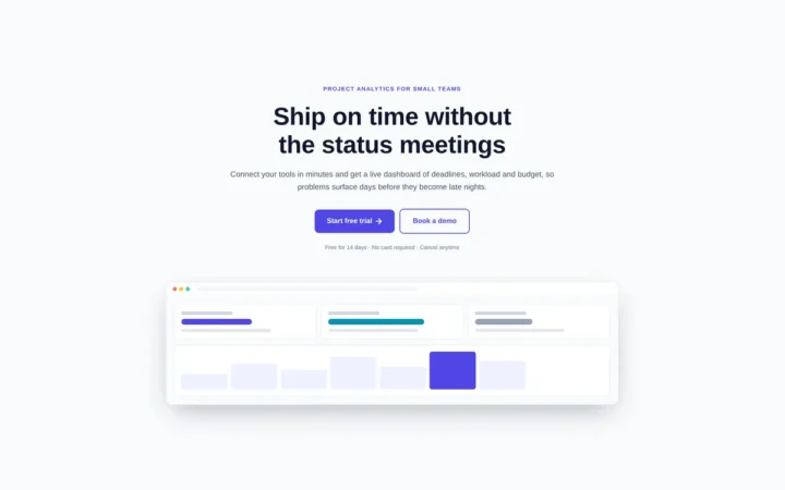
Centred hero with a large headline, supporting text and two buttons, with optional highlights and a product window…

Dark studio hero with service highlights
Centred hero with a large headline, supporting text and two buttons, with optional highlights and a product window…
Related articles

Natural-Looking Box Shadows with Layered Shadows
Why one big shadow looks flat and several soft ones look real, measured pixel by pixel in Chromium, with copy-ready elevation recipes…
Elementor Free vs Pro: What You Can Build with the Free Version
What Elementor's free version includes, what Pro adds on each plan, a worked example of a brochure site built for free, and…

How to Add LocalBusiness Schema to a WordPress Site
Build LocalBusiness JSON-LD for a WordPress site: the right subtype, Google's required and recommended properties, awkward opening hours, a tested must-use plugin…
Related guides
How Long Should a Meta Title Be? Pixels vs Characters Explained
"Keep it under 60 characters" is only half right. Google cuts titles by pixel width, not character count. Learn how to write…
The Default WordPress .htaccess File (and Safe Additions)
The exact .htaccess rules WordPress needs for pretty permalinks, what each line does, tested additions for HTTPS and file protection, and a…
Fluid Typography in Elementor with clamp()
Setting a heading to 56 px on desktop, 44 px on tablet and 32 px on mobile works, but text jumps between…
Comments