
Building an Elementor Hero Section That Works on Mobile
A mobile-first Elementor hero, step by step: per-device background images (tested: phones download only the mobile image), overlay darkness for readable text, and safer heights than 100vh.
 Keyur
10 min read

On this page
A hero section that works on mobile has these features:
- A short headline that wraps cleanly.
- A heading size that scales down for phones.
- One clear call to action that can be tapped easily.
- A background image cropped and sized for small screens.
- Enough overlay behind the text to keep it readable.
- A height that does not push the button below the first screen.
In Elementor, you get there by building the hero in a Flexbox container, then adjusting the Mobile view: stack the columns, reduce padding, swap in a smaller background image and lower the minimum height. Avoid fixed 100vh heights on phones.
This post builds a mobile-first hero step by step with Elementor's free features. It covers the background-image, height and contrast decisions that most often go wrong. We checked three of them in Chromium: which background image a phone downloads, which element counts as the page's Largest Contentful Paint, and how dark an overlay must be for white text to pass WCAG contrast.
What makes a hero fail on mobile
Table: Common mobile hero problems
| Problem | What visitors see | Usual cause |
|---|---|---|
| Headline overflows or breaks badly | Huge words split across lines, or sideways scrolling | Desktop font size inherited on Mobile |
| Button below the fold | Only a heading and image on the first screen | Large top padding plus a 100vh minimum height |
| Unreadable text over the photo | White text on a bright sky | No overlay, or one that is too light |
| Subject of the photo cropped out | A shoulder instead of a face | Desktop background position used on a tall, narrow screen |
| Slow first paint | Blank area while a large image loads | Desktop-sized image sent to phones |
| Jumping layout | Content shifts as browser bars appear and hide | Height tied to the viewport |
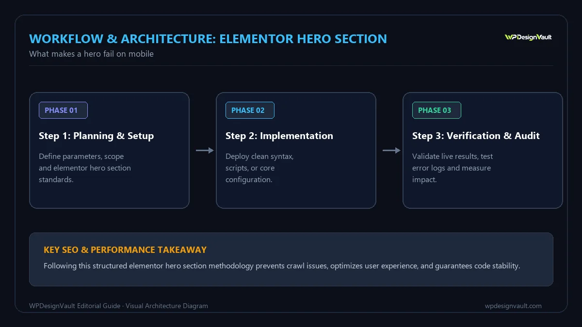
Before you start
- Write the content first. A headline of about six to ten words, one supporting sentence, and one primary button. Long copy is the main reason heroes overflow on phones.
- Prepare two images if you use a background photo: a wide one for desktop (around 1920 pixels) and a portrait or square crop for mobile (around 800 to 1000 pixels wide).
- Set global fonts and colours in Site Settings so sizes and colours stay consistent.
- Know your breakpoints. By default Elementor's Mobile view applies up to 767 pixels and Tablet up to 1024. Our guide to Elementor responsive design explains how values carry down from Desktop.
If you would rather start from a working layout, the free hero sections in our hero template library are built with Elementor's free widgets. For example, the restaurant hero with booking buttons stacks its two columns on tablet and mobile and reduces its heading from 56 to 38 pixels.
Step 1: build the structure
- Add a Flexbox container for the hero. Set its content width to boxed and its direction to row on Desktop.
- Inside it, add two containers: one for text, one for an image or visual. If the hero is text over a background photo, use a single inner container instead.
- In the text container, add a Heading widget (set its HTML tag to H1), a Text Editor widget for the supporting line, and a Button widget.
- Give the outer container padding of about 96 pixels top and bottom on Desktop.
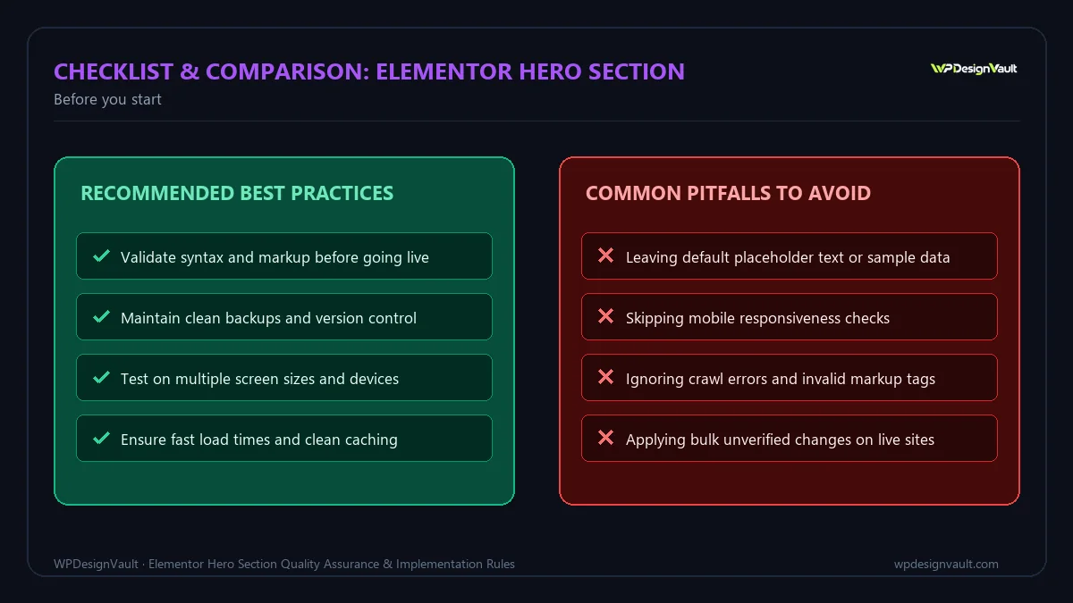
Step 2: adjust the Mobile view
Switch the editor to Mobile using the device icon, then change only what needs to differ:
- Direction: set the outer container to column so the text sits above the visual. Use the order setting only if the visual must come first, and remember screen readers follow the HTML order.
- Widths: set inner containers to 100% width.
- Padding: reduce to about 40 to 56 pixels top and bottom, and 16 to 20 pixels at the sides.
- Heading size: reduce it, or better, use a fluid size with
clamp()that scales automatically. Our guide to fluid typography in Elementor shows how, and the CSS clamp generator calculates the value. - Alignment: left-aligned text is usually easier to read on narrow screens than centred text over several lines.
- Button: make it full width or at least comfortably large. WCAG 2.2 sets a minimum target size of 24 × 24 CSS pixels at level AA; larger buttons with space around them are easier to tap.
Step 3: handle the background image
Elementor's Background Image control is responsive: you can set a different image for each device. Use that to send phones a smaller, portrait-friendly crop.
- Select the hero container and open Style → Background.
- Choose the Classic background and set the desktop image.
- Switch to Mobile and choose the mobile image.
- On each device, set the position (for example "center center" or a custom focal point) so the subject stays visible, and set Size to Cover.
We checked how this behaves in Chromium with a page that uses the same pattern Elementor produces: a desktop background image, replaced by a mobile image inside a mobile media query. At a 390-pixel phone width, the browser downloaded only the mobile image. At 1440 pixels it downloaded only the desktop image. So a per-device background does save data on phones.
The same test showed the hero's background image was the page's Largest Contentful Paint (LCP) element at both widths. That makes its file size directly important for Core Web Vitals. Resize and compress both versions before uploading. The image resizer can produce each crop at the right width.
Step 4: make the text readable over the image
Text over a photo has to stay readable over the brightest part of the image. Elementor's free Background Overlay adds a colour layer between the image and the text. The question is how dark it needs to be.
We calculated the contrast of white text over a black overlay on top of a pure white area of a photo, the worst case:
Table: White text over a black overlay on a white image area (WCAG contrast)
| Overlay opacity | Resulting background | Contrast ratio | Normal text (4.5:1) | Large text (3:1) |
|---|---|---|---|---|
| 30% | #B2B2B2 | 2.12:1 | Fails | Fails |
| 40% | #999999 | 2.85:1 | Fails | Fails |
| 50% | #808080 | 3.95:1 | Fails | Passes |
| 55% | #737373 | 4.74:1 | Passes | Passes |
| 60% | #666666 | 5.74:1 | Passes | Passes |
So, if any part of the photo behind the text can be white, a black overlay of at least about 55% keeps white body text above 4.5:1. A big headline alone can manage with about 50%. Darker photos need less; check the actual brightest area with the contrast checker. A gradient overlay that is darker behind the text and lighter elsewhere keeps more of the photo visible.
Step 5: choose the height carefully
Elementor's container Min Height control offers px, em, rem, vh and a custom unit, and suggests 100vh for a full-screen container. On phones, 100vh is a problem. Mobile browsers show and hide their address bars as you scroll, and the classic vh unit does not match the visible area. A 100vh hero is often taller than the screen, which pushes the button out of view, and the layout can jump.
Better options on Mobile:
- No minimum height. Let the content and padding decide. This is the most robust choice.
- A modest fixed minimum, such as 480 to 560 pixels, if the design needs a tall image area.
- The newer viewport units through Elementor's custom unit:
svh(the small viewport, with browser bars showing) is stable and never taller than the visible screen. For example, enter80svh. Check your audience's browsers, as older ones do not support these units.
Worked example: a service business hero
An illustrative cleaning company wants a hero with a photo, the headline "Spotless offices, every weekday morning", one line of supporting text and a "Get a quote" button.
Table: Settings for the example hero
| Setting | Desktop | Mobile |
|---|---|---|
| Container direction | Row (text left) | Column |
| Padding (top/bottom, sides) | 96px, auto (boxed) | 48px, 20px |
| Min height | 640px | None |
| Background image | 1920 × 1080 photo, center | 900 × 1200 crop, center 30% |
| Overlay | Black gradient 70% to 20% left to right | Solid black 55% |
| Heading | H1, fluid size, maximum 56px | Same clamp(), about 34px at 390px |
| Button | Auto width | Full width |
On a 390-pixel screen, the heading, supporting line and button all appear on the first screen. The face in the photo stays visible because the mobile image is a portrait crop with its own focal point.
Verify the result
- Preview in Elementor's Mobile view, then on the live page in a browser's device toolbar at 360, 390 and 430 pixels.
- Confirm the button is visible without scrolling at common phone heights.
- Check the Network panel: only the mobile background image should load at phone widths.
- Check text contrast over the brightest part of each image.
- Test on a real phone, scrolling up and down to see if the layout jumps as the browser bars move.
- Run a page speed test and look at the LCP element and its timing.
Common mistakes
- Using 100vh on Mobile and pushing the call to action off the first screen.
- Uploading one huge background image for every device.
- Leaving the Heading widget at the default H2, so the page has no H1.
- Very long headlines that need five lines on a phone.
- Light overlays that leave white text unreadable on bright photos.
- Two or three equal-weight buttons competing for attention.
- Hiding a desktop hero on mobile and adding a second mobile hero, so phones load both.
Troubleshooting
Table: Mobile hero problems and fixes
| Symptom | Likely cause | Fix |
|---|---|---|
| Page scrolls sideways | Fixed-width element or oversized heading | Set widths to 100% and reduce the Mobile font size |
| Hero taller than the screen | 100vh minimum height | Remove it on Mobile, or use svh via the custom unit |
| Desktop image still used on phones | Mobile background image not set, or caching | Set the Mobile image; regenerate Elementor CSS and purge caches |
| Subject cropped out | Background position set only on Desktop | Set position per device, or use a custom focal point |
| Hero text unreadable | Overlay too light | Increase overlay opacity or use a gradient behind the text |
| Slow LCP | Large background image | Resize and compress, and use a smaller mobile crop |
Frequently asked questions
How do I make an Elementor hero section responsive?
Build it in a Flexbox container, then switch to the Tablet and Mobile views and change only what differs: direction to column, smaller padding, smaller or fluid heading sizes and a mobile background image.
Should a hero be 100vh on mobile?
Usually not. Mobile browser bars make 100vh taller than the visible screen, which can push the button out of view. Use no minimum height, a modest pixel value, or svh through the custom unit.
Can I use a different background image on mobile?
Yes. Elementor's Background Image control is responsive. In our Chromium test of the same CSS pattern, phones downloaded only the mobile image.
How dark should the overlay be for white text?
If the photo can be white behind the text, at least about 55% black keeps white body text above WCAG's 4.5:1 ratio. Large headlines can pass at about 50%.
Is the hero image my page's LCP element?
Often, yes. In our test, the hero's background image was the Largest Contentful Paint element at both phone and desktop widths, so its file size matters.
Should the hero heading be an H1?
Yes, on most pages the hero headline is the page's main heading. Elementor's Heading widget defaults to H2, so change it.
How long should a hero headline be?
Short enough to fit in about three lines on a phone, which is usually six to ten words. Put detail in the supporting sentence.
Do I need Elementor Pro for a responsive hero?
No. Containers, responsive settings, per-device background images and background overlays are all in the free version.
How do I keep the photo's subject visible on phones?
Use a separate mobile crop and set the background position for the Mobile device, so the subject stays in the visible area of a tall, narrow screen.
Should I hide the hero image on mobile?
Hiding it with Elementor's visibility settings still sends the HTML. It is better to set a smaller mobile background or design the hero so the image works at every size.
Next step
Open your home page at a 390-pixel width, check whether the call to action is visible without scrolling, and adjust the Mobile padding, height and heading size. Or start from a free hero in our hero template library and adapt it.
Related free tools for this topic
Aspect Ratio Calculator
Find the aspect ratio of any width and height, and calculate a new width or height that keeps…
WordPress Snippet Generator
Generate clean, escaped WordPress code for the tasks developers repeat most: enqueueing scripts and styles, shortcodes, widget areas,…
WordPress Salt & Security Key Generator
Generate a fresh set of WordPress security keys and salts in your browser, ready to paste into wp-config.php.
wp-config.php Generator
Generate a complete wp-config.php with database details, newly generated security keys, debug settings and useful constants. Keys are…
Custom Taxonomy Generator
Generate clean, translation-ready register_taxonomy() code for WordPress, with category-style or tag-style behaviour, block editor support and admin columns.
HTTP Security Headers Generator
Generate recommended HTTP security headers for your site and get them as Apache, Nginx or WordPress PHP code.
Related resources

SaaS hero with dashboard preview
Two-column hero: headline, supporting text, two buttons and a trust line beside a visual panel. Stacks to one…
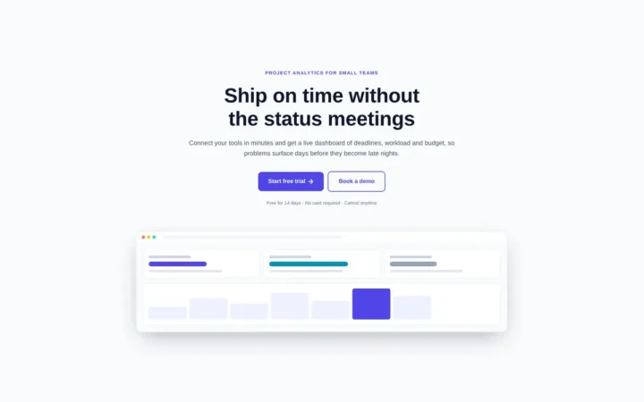
Centred SaaS hero with product window
Centred hero with a large headline, supporting text and two buttons, with optional highlights and a product window…

Dark studio hero with service highlights
Centred hero with a large headline, supporting text and two buttons, with optional highlights and a product window…
Related articles
Custom Box Shadows and Gradients in Elementor
What Elementor's free shadow and gradient controls can do, where they stop (one shadow, two colours), and copy-ready CSS for layered shadows,…

Using CSS Variables in Elementor
How Elementor names and scopes its global colour and font variables, how to define and use your own in Free and Pro,…
Elementor Free vs Pro: What You Can Build with the Free Version
What Elementor's free version includes, what Pro adds on each plan, a worked example of a brochure site built for free, and…
Related guides
How Long Should a Meta Title Be? Pixels vs Characters Explained
"Keep it under 60 characters" is only half right. Google cuts titles by pixel width, not character count. Learn how to write…

The Default WordPress .htaccess File (and Safe Additions)
The exact .htaccess rules WordPress needs for pretty permalinks, what each line does, tested additions for HTTPS and file protection, and a…
Fluid Typography in Elementor with clamp()
Setting a heading to 56 px on desktop, 44 px on tablet and 32 px on mobile works, but text jumps between…
Comments