
Build an Elementor Comparison Table That Works on Mobile
Comparison tables that look great on desktop often collapse on phones. Compare three mobile patterns (stacked cards, a sticky-column table and one plan at a time), learn the accessibility trade-offs, and build a responsive comparison in Elementor Free.
 Keyur
5 min read
On this page
A comparison table that reads perfectly at 1440 pixels often collapses into a squashed grid of tiny text on a 390-pixel phone. Since many visitors compare plans on their phones, the mobile version deserves as much care as the desktop one. This guide explains three patterns for an Elementor comparison table that works on mobile, the accessibility trade-off of each, and how to build one with Elementor Free.
Short answer: for two to four plans with a handful of features, stack each plan as a card on phones. For many features across many plans, keep a real HTML table and let it scroll sideways with the feature column fixed. For long, detailed plans, show one plan at a time with a selector. Use a genuine <table> whenever the content is truly tabular, because screen readers can announce its rows and columns.
Why comparison tables break on phones
A three-plan table needs four columns: one for feature names and one per plan. At 390 pixels wide, minus page padding, each column gets well under 100 pixels, too narrow for a feature name like “Priority email support”. Browsers then wrap words onto many lines, shrink text, or push the table wider than the screen, which causes the whole page to scroll sideways.
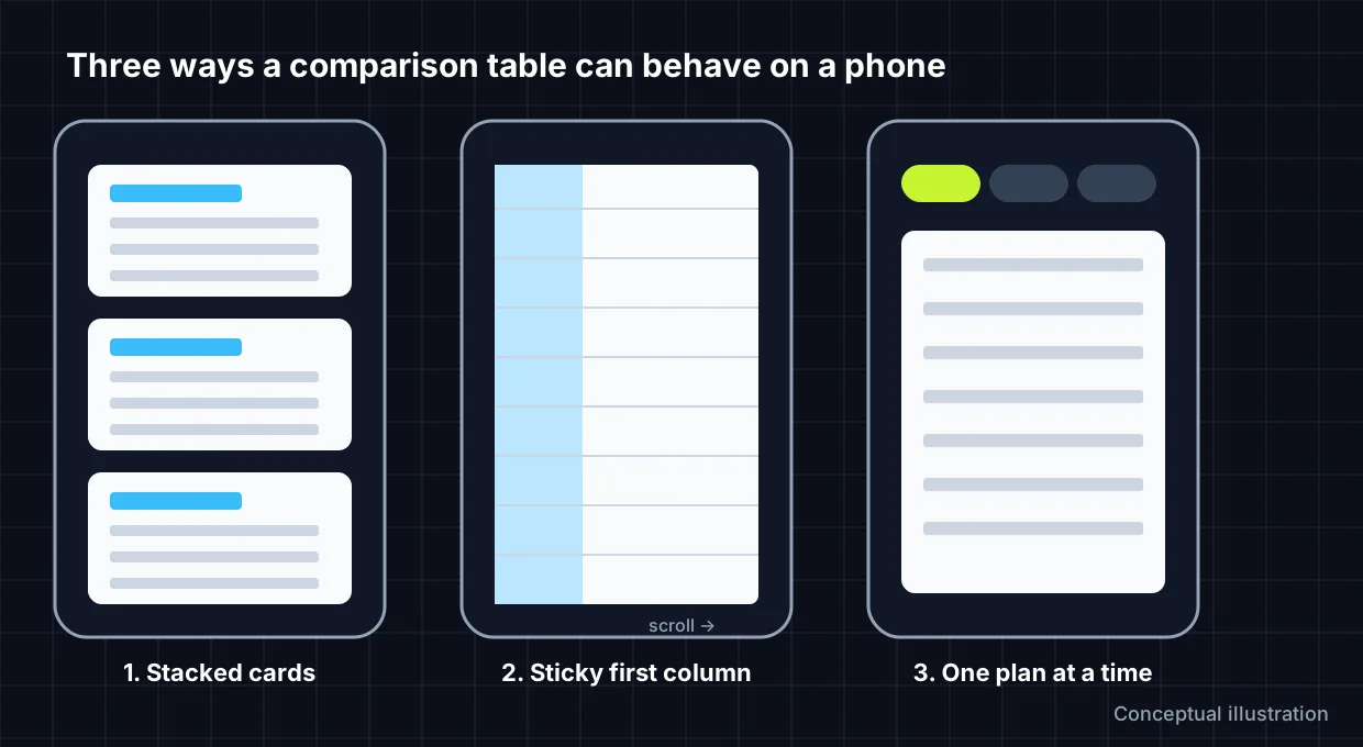
Three mobile patterns
| Pattern | Best for | Accessibility | Trade-off |
|---|---|---|---|
| Stacked cards | 2–4 plans, under ~8 features | Good if each card uses a heading and a list | Harder to compare one feature across plans |
| Sticky first column, horizontal scroll | Many features or plans | Best: a real table keeps row/column relationships | Needs a visible scroll cue; the scroll area must be keyboard-focusable |
| One plan at a time | Long, detailed plans | Good with a labelled selector | Visitors can’t see two plans at once |
Pattern 1: stacked cards
On desktop, plans sit side by side as columns. On phones, each plan becomes a full-width card: plan name as a heading, price, a list of included features, and a button. This is the easiest pattern to build in Elementor because containers stack naturally. Repeat the same features in the same order in every card so visitors can compare by scrolling.
Pattern 2: real table with a sticky feature column
Keep a real HTML table inside a wrapper that scrolls horizontally, and fix the first column with CSS so feature names stay visible. This preserves the table semantics screen readers rely on. Mark each column and row header with <th> and a scope, as the W3C tables tutorial explains, and make the scroll wrapper keyboard-focusable with a label.
<div class="compare-scroll" role="region" aria-label="Plan comparison" tabindex="0">
  <table>
    <thead>
      <tr><th scope="col">Feature</th><th scope="col">Starter</th><th scope="col">Pro</th></tr>
    </thead>
    <tbody>
      <tr><th scope="row">Projects</th><td>3</td><td>Unlimited</td></tr>
    </tbody>
  </table>
</div>

<style>
.compare-scroll { overflow-x: auto; }
.compare-scroll table { min-width: 560px; border-collapse: collapse; }
.compare-scroll th[scope="row"], .compare-scroll thead th:first-child {
  position: sticky; left: 0; background: #fff;
}
</style>
Replace the sample plan names and values with your own. In Elementor Free, place this markup in an HTML widget, or put the table in a Text Editor widget and add the CSS to your theme’s Additional CSS. Elementor Pro’s per-element Custom CSS is an alternative if you have Pro.
Pattern 3: one plan at a time
A row of buttons (Starter, Pro, Business) above a single plan panel. It suits long feature lists but needs a little JavaScript or Elementor’s Tabs widget. If you use tabs, check that the tab labels are buttons that can be reached with the keyboard and announce which plan is selected.
Build stacked comparison cards in Elementor Free
- Add a container and set its direction to Row on desktop. Add one child container per plan.
- In each plan container, add a Heading (plan name), a Heading or Text Editor (price), an Icon List (features) and a Button.
- Keep features in the same order in every plan. Use the same icon for “included” and a clearly different one for “not included”, and write the words too: don’t rely on icons or colour alone.
- Switch Elementor’s responsive mode to Mobile and set the parent container direction to Column. Give child containers 100% width.
- Highlight the recommended plan with a border and a visible “Recommended” label, not colour alone.
- Preview at tablet and mobile widths and check there’s no sideways page scroll.
If you’re starting from a pricing layout, the three-tier SaaS pricing section is a ready-made base. For the general approach to breakpoints, see responsive design in Elementor, and to check what Free can and can’t do, read Elementor Free vs Pro.
Accessibility checklist
- Tabular data uses a real table with header cells (
scope="col"andscope="row"). - “Included” and “not included” are conveyed in text, not only with ticks, crosses or colour.
- Text contrast is at least 4.5:1 for body text.
- Scrollable areas are keyboard-focusable and labelled.
- Buttons describe their destination, for example “Choose Pro” rather than “Click here”.
FAQs
Does Elementor Free have a table widget?
Elementor Free doesn’t include a dedicated table widget. You can build tables with the HTML or Text Editor widgets, build card layouts with containers, or use a third-party add-on.
Should I hide the table on mobile and show something else?
Avoid maintaining two separate versions of the same data: they drift out of sync. Use one structure that adapts, such as stacked cards or a scrolling table.
How many plans should a comparison show?
Three is common because it fits desktop widths and keeps decisions simple. Beyond four, consider a scrolling table or a plan selector.
Are tick and cross icons enough?
Add text alongside them, such as “Included” or “Not included”, or visually hidden labels, so the meaning doesn’t depend on recognising an icon.
Related free tools for this topic
WordPress Snippet Generator
Generate clean, escaped WordPress code for the tasks developers repeat most: enqueueing scripts and styles, shortcodes, widget areas,…
WordPress Salt & Security Key Generator
Generate a fresh set of WordPress security keys and salts in your browser, ready to paste into wp-config.php.
wp-config.php Generator
Generate a complete wp-config.php with database details, newly generated security keys, debug settings and useful constants. Keys are…
Custom Taxonomy Generator
Generate clean, translation-ready register_taxonomy() code for WordPress, with category-style or tag-style behaviour, block editor support and admin columns.
HTTP Security Headers Generator
Generate recommended HTTP security headers for your site and get them as Apache, Nginx or WordPress PHP code.
301 Redirect Generator
Paste old and new URLs to generate exact-match redirect rules for Apache (.htaccess), Nginx or a WordPress snippet.…
Related resources

SaaS hero with dashboard preview
Two-column hero: headline, supporting text, two buttons and a trust line beside a visual panel. Stacks to one…
Centred SaaS hero with product window
Centred hero with a large headline, supporting text and two buttons, with optional highlights and a product window…

Dark studio hero with service highlights
Centred hero with a large headline, supporting text and two buttons, with optional highlights and a product window…
More guides
How to Optimise SVG Icons for Elementor
SVG icons that won't resize or recolour in Elementor usually have fixed dimensions or hard-coded colours. Learn what viewBox, width, height and…
Add a Trust Section Below Your Elementor Hero
The section under your hero is where visitors look for proof. Decide whether a logo strip, stats band or single testimonial fits…
Fluid Typography in Elementor with clamp()
Setting a heading to 56 px on desktop, 44 px on tablet and 32 px on mobile works, but text jumps between…
Comments